1/03/2011
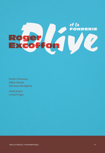
«Roger Excoffon et la Fonderie Olive», par Dave Farey
Altough Roger Excoffon (1910–1983) has other claims to fame–as an outstanding graphic designer and poster artist, and founder of two advertising agencies–this book is concerned primarily with the typefaces he designed during his thirty-year association with the Olive Foundry in Marseilles.
The first quartier of the book is a history of the foundry, which dates back to the seventeenth century. Marcel Olive took over from his father Albert in 1940, having married Excoffon sister in 1934. At the end of the war in 1945 he offered Excoffon the direction of the Paris agency of his foundry. Excoffon wrote: ‘I had never held a paid position in my life, I was 35 years old and responsible for a family with two children. My anwer was: Yes’.
Marcel Olive had ambitions to the rival the Paris foundry Deberny & Peignot. Excoffon’s first typeface Chambord, cas intended to compete with Cassandre’s Peignot typeface. Charles Peignot accused Olive and Excoffon of plagiarism and considered legal action, but the matter was resolved cordially. Between 1951 and 1958 Excoffon designed five display typefaces. The first was a capital-only typeface with bold, assertive shapes. It was said that no other typeface so well symbolised the post-war reconstruction of France. According to Excoffon, the typeface’s development involved ‘industrial espionage’ Deberny & Peignot were planning a new typeface to be designed by Marcel Jacno and named after him. A promotional photograf appeared, of Jacno working on his letters. Excoffon got out his magnifying glass and scrutinised the forms. Cheekily, Excoffon’s face was called Banco–just one letter different from ‘Jacno’.
Excoffon’s next typeface, Mistral, was basde on his own handwriting and miraculously overcame the physical constraints of metal type. It was an immediate success. Adrian Frutiger wrote ‘My dear Roger, the day I received Mistral, I spent the whole day with a linen tester (magnifying glass) asking myself: ”How did he do it?”’ Then came Choc, with its bold, brush-written character, and the copperplate script face Diane, followed by Calypso, probably Excoffon’s most brilliant and dynamic typeface swith its three-dimensional effect and half-tone patterns.
During 1955 Excoffon began to work on a totally original sans serif alphabet which eventually became the Antique Olive family, Olive’s response to other ‘Neo-Grotesques’ such as Helvetica, Univers and Folio. Excoffon’s final design was the aborted serif text-face Excoffon Book.
The book covers all these faces in detail, and concludes with interviews and articles by Excoffon originally published in the 1950s. It is beautifully produced publication, copiously trials, type specimens and promotional material. These illustrations alone make it a valuable addition to the literature on typography ans type design. My only complaint is the lack of hard cover! Its 323 pages, printed on 130gsm, make it fairly heavy and potentially floppy item.
The text is both French and English.