
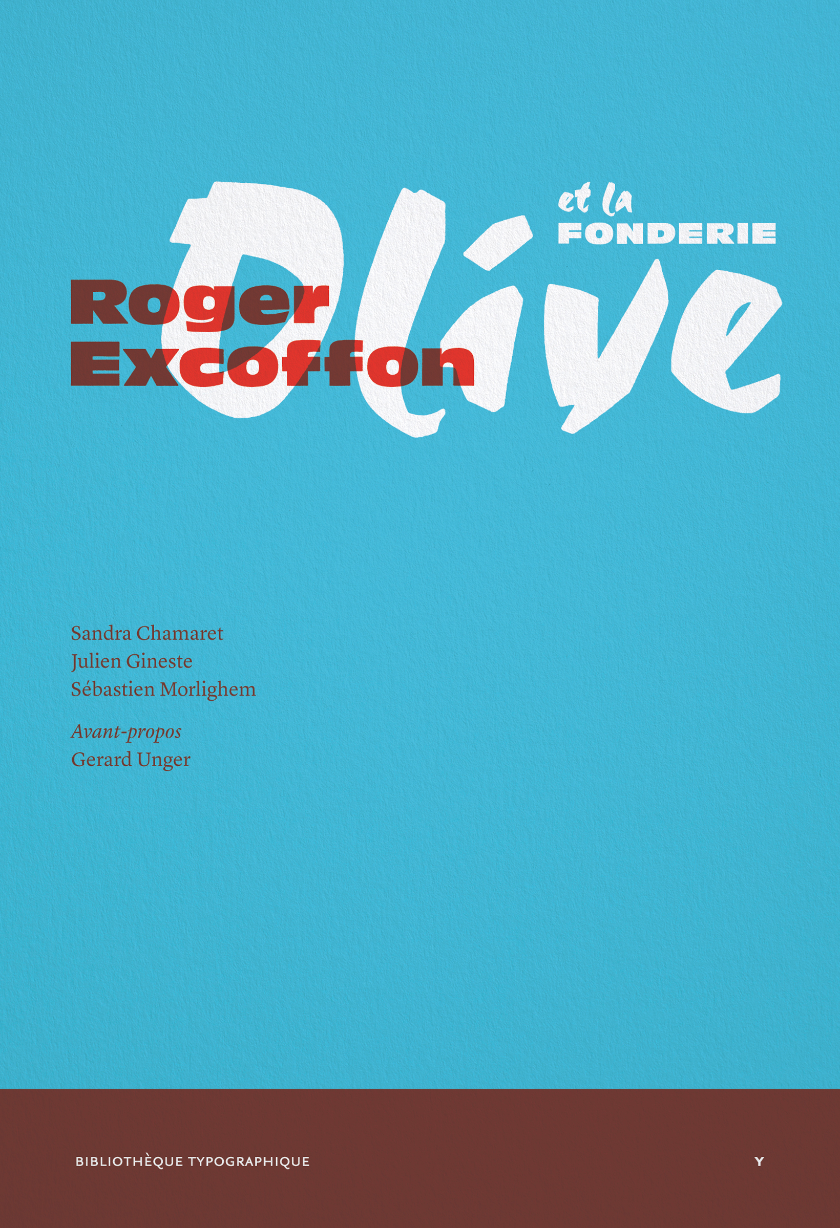
Roger Excoffon et la fonderie Olive
Avant-propos de Gerard Unger.
Roger Excoffon (1910–1983) fut durant plusieurs décennies une figure majeure de la typographie, du graphisme et de la communication visuelle en France. La majeure partie des caractères qu’il a conçu pour la fonderie Olive de Marseille entre 1945 et 1971, avec le soutien actif de son directeur Marcel Olive et la complicité de ses collaborateurs (José Mendoza y Almeida, Gérard Blanchard), sont devenus des classiques de l’imprimerie publicitaire. Ils ont par ailleurs envahi l’espace urbain et les façades des magasins bien au-delà de la France et demeurent toujours visibles : nous avons tous rencontré un jour le Banco, cet alphabet de lettres capitales brut et dynamique, ou le Mistral, adaptation réussie de l’écriture de « l’homme du XXe siècle ».
Cet ouvrage, publié à l’occasion du centenaire de sa naissance, célèbre une œuvre d’une rare popularité à travers de nombreux documents peu connus ou inédits (textes, dessins, photographies, publicités, spécimens…). Il met en valeur une approche personnelle nourrie par les arts plastiques et les sciences humaines, avec une exigence propre aux impératifs de l’industrie typographique. Pour la première fois, l’histoire de la fonderie Olive est racontée ; chaque caractère est présenté, analysé, illustré ; les principaux écrits d’Excoffon relatifs à son métier et à sa vision de la typographie sont réédités.
en
Roger Excoffon (1910–1983) was a major figure in French typography, the graphic arts and visual communication. Most of the typefaces that he designed for the Olive foundry in Marseilles between 1945 and 1971 with the active support of his director Marcel Olive and his assistants (José Mendoza y Almeida, Gérard Blanchard) became classics of advertising printing. These typefaces took over the storefronts and urban space of France and beyond. They can still be seen today : we have all come across Banco, an alphabet of brawny and dynamic capitals, or Mistral, a successful adaptation of the handwriting of the “man of the 20th century”.
This book was published on the occasion of the centenary of his birth. It celebrates a work of uncommon popularity and draws on little-known or previously unpublished documentary material (texts, drawings, photographs, advertisements, specimens, etc. ). It highlights Excoffon’s personal approach, which found its inspiration in the pictorial arts as well as the social sciences, while meeting the imperatives of the typographic industry. The history of the Olive foundry is told here for the first time : each typeface is presented individually, analysed and illustrated. This publication is completed with reprints of texts by Excoffon about his craft and his ideas on typography.