1/01/2011
«French letters», par Paul Barnes
A new book on Roger Excoffon tells the story of the man who made French typography soar.
Graphically, France looks a lot like it does because of Roger Excoffon. Not only did he create the iconic logo for Air France, but his touch is there in just about every town square. Look at the signs above the boulangerie, the coiffeur and the parfumerie — many will be set in Excoffon’s confident typefaces; there’s no generic Arial here.
As France in the 1930s was defined by the graphic design of Cassandre and art deco, so in the 1950s and the 1960s, Excoffon was the designer of choice. His posters and other graphic works have a unique vibrancy and drama. While Cassandre’s work was studied and perfectly crafted, Excoffon’s is spontaneous, full of movement. Yet, like the man, it is built on discipline, study and practice.
Excoffon was born into a wealthy Marseilles family in 1910 and was expected to follow his father into the law. He spent his twenties in Paris, where he began to paint. This might have remained a hobby, except that Excoffon’s sister had married Marcel Olive, a young, ambitious man who ran the family business, the type foundry Olive. With a young family to support, Excoffon turned to designing letters. Type design has always been the most intense and serious of the graphic arts, but Excoffon’s painterly background meant there was a fluidity to his style.
Excoffon made type design sexy and, in terms of creativity and daring, he was closer to Yves Saint Laurent that the average type designer. His designs were joyful and exciting in the drab post-war years. While his first design, Chambord, was tentative, he began to assert himself whith his work on Vendôme. Though it was created by François Ganeau, a stage designer, Excoffon effectively art directed this beautiful Garamond-style typeface, perfectly suited for any fine bottle of French wine. While Garamond could be static and reserved, Vendôme is sharp, angular and daring.
In Excoffon’s own designs, the rapid movement of his brush is somehow caught in static type. In his first groundbreaking design, Banco (1951), each letter is formed by the minimal number of sharp and dramatic brushstrokes required. It looks like is has been drawn with the broad stroke of a marker, not unlike the mark of a modern graffiti artist. Immediately, is became one of the definitive typefaces of the era.
Two years later, Excoffon redefined the world of script letter. Previously, the market had been dominated by the careful elegance of the copperplate or the brush-like style of a poster designer. With Mistral, Excoffon created a script in part inspired by his own handwriting, but also a script that looked like the writing of the 20th century man, if that man had taste and beautiful hand. A similar mastery of the craft can be seen in perhaps the strangest of his creations, Calypso. Created from the card that had been shaped to form letters, the tonality is translated into the halftone world of dots (not unlike a piece of pop art).
Excoffon’s last type design, and his first sans serif, was the Antique Olive series. While the taste at this time for modernised 19th century designs like Univers and Helvetica, Antique Olive is truly unique. Built on extensive research into legibility, it had large ‘x’ heights and an unusual top heavy style. The series included the bold Nord font and became the largest family Excoffon created.
In 1956 he set up his own advertising agency Urbi et Orbi (major clients included the French railway and postal services) and became the art director of Air France, where he was responsible for posters, campaigns and the trademark logo. His poster for Concorde captures the joy and glamour of flight, using just a few paint strokes to illustrate movement.
The same movement can be seen in Excoffon’s outstanding set of Olympic icons for the 1968 Winter Olympics held in Grenoble. Rather than the simple stick man so beloved of later designs, his icons used a variation of strokes in simple black and white to immediately summon up the drama of sport.
By the time of his death in 1983, France had grown tired of the mark of Excoffon. The optimism of the 1950s anf the 1960s had disappeared by the 1970sn and his letters had been downgrated from the chicest boulevards to the cheap ’stack ’em ’up hypermarchés that dot every French suburb — but even here you cound’t deny how recognisable they were, which had walways been his aim.
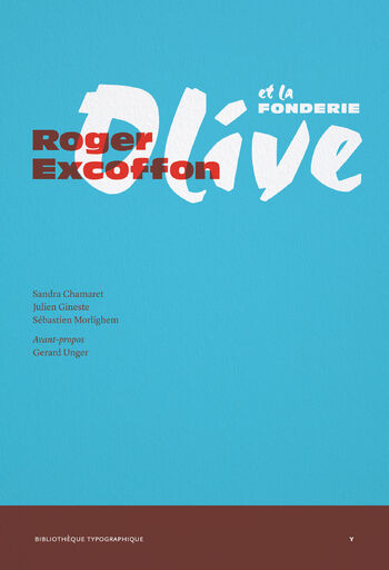
Thankfully, Excoffon had gradually returned to favour as fashionable young designers have helped to rebuild his reputation. Various exhibitions have been held and, cementing his place in the design firmament, a trio a young enthusiasts, Sandra Chamaret, Julien Gineste and Sébastien Morlighem, have now written a wonderful book about La Fonderie Olive and Excoffon’s work.