1/03/2011
«Monograph Brings Renewed Appreciation For Roger Excoffon», par Yves Peters
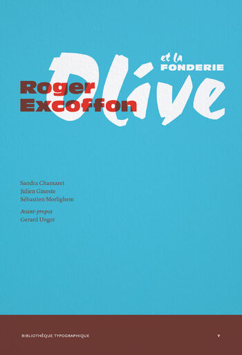
Named one of the Top 10 Typographic Events of 2010 on Imprint by awarded calligrapher and typographer Paul Shaw, the new Paris-based Ypsilon.éditeur has published monographs on two important 20th century French type designers in its Bibliothèque Typographique series. The first of these two books celebrating Latin type design was José Mendoza y Almeida, published in March last year. Written by renowned type designer Martin Majoor and Sébastien Morlighem who oversees the Bibliothèque Typographique, it consists of essays on Pascal, ]…, ITC Mendoza Roman and other less-known typefaces. Seeing the two authors’ gripping presentation at TYPO Berlin 2010 – Passion made me rush to the book stand, buy myself a copy, and have it signed. This excellent book reacquainted me with the work I already knew, and introduced me to more obscure designs of his. This left me quite anxious to get my hands on the second book in the series: Roger Excoffon et la fonderie Olive, written by Sandra Chamaret, Julien Gineste and Sébastien Morlighem, and published last November.
Roger Excoffon (1910–1983) was a major figure in French typography, the graphic arts and visual communication. Most of the typefaces he designed for the Olive foundry in Marseilles between 1945 and 1971 – with the active support of his director Marcel Olive, and his assistants José Mendoza y Almeida and Gérard Blanchard – became classics of advertising printing. Yet despite their omnipresence in the French urban landscape and beyond – or maybe because of it – Excoffon’s creations seem to have fallen from grace, especially since Modernism in the 1960s. On a personal level, these quintessential French faces are part of my cultural heritage. My two grand-mothers came from Wallonia, the French-speaking part of Belgium; my brother, sister and I were raised in French; and we spent almost all of our childhood summer holidays at the Côte d’Azur […]
[…] Alongside the obligatory pictures of the protagonists of the book, the wealth of typographic illustrations is astonishing. From concept sketches over type drawings to finished specimens and advertising, the book is full to the brim with both black-and-white and colour images. On the one hand they illustrate Excoffon’s personal approach, which found its inspiration in the pictorial arts as well as the social sciences, while meeting the imperatives of the typographic industry. On the other hand they provide the reader a fascinating insight into how the Olive Foundry marketed and advertised their type.
Besides offering a comprehensive overview of someone’s life and body of work, good monographs should teach you something new. The best ones however make you reappraise what you thought you knew, challenging your previous opinion. And this is exactly what Roger Excoffon et la fonderie Olive succeeded in doing. The book is full of nuggets, like finding out the real reason why Banco was designed, and how it managed to defeat its direct competitor Jacno from Deberny & Peignot. For example I never thought much of Mistral, but reading its story and technical background finally made me appreciate the ingenuity of this remarkable achievement in type design. And the chapter on Antique Olive makes a convincing case of having this family up there with Univers and Helvetica in the pantheon of great post-war sans serif families. Roger Excoffon et la fonderie Olive is a fascinating, insightful, and entertaining book, which should be on any serious typophile’s must-read list.
